
The Ultimate Curtain Size Guide: How to Measure Curtains, Window Dimensions & Standard Curtain Sizes
19 Jun, 2026

Curtains today go beyond being a mere practical object. The right colour and style choice can capture and influence the overall aesthetic beauty of a space. The right use of colour can even allow a space to appear larger and more open, brighter, or even provide a cosy atmosphere. This 2026 trend is forecasted to encourage the use of soft, earthy shades and layers to create a space that is both comfortable and refined.
The hue of your curtains should consider the interplay of light, furniture, wall finish, and the emotions that you would like to evoke in the space. This guide will touch on some of the factors to consider when selecting curtains for living room colour ideas and curtain combination suggestions to aid in making the right choice in a style that you love. Curtains and wall colour combinations are integral to the overall look you wish to achieve, and these will certainly help to create the look you wish for your interior space.
When combined successfully, a curtain colour combination can take an average living room to a new level of sophistication, making it an inviting, cohesive space. Because they influence the overall look of a room, coverings should be considered in relation to the other elements of the space. With the focus of current interior design trends being a mix of personalisation, sustainability, and mood-boosting colour palettes, the window treatments a homeowner selects become a much more important decision.
With the right wall and curtain colour combination, and the right treatments for the curtain rods, the odours, textures, and proportions of light and room will be balanced, and the overall look and feel of the space will be elevated to the desired level. This guide provides practical and inspirational ideas for working with curtain colours for living rooms so that the space can be expanded visually, made more intimate and comfortable, or a combination of both. With insights and practical tips about working with the right textures and hues, you will be empowered to choose classy curtains for living room setups that will fulfil both your functional and decorative needs.
Curtains can transform the overall design of the interior of the house as they impact the amount of light coming in, the way colours combine, and the way space is perceived. A well-designed curtain colour combination can highlight certain architectural features, soften glare, and foster a particular mood in the space that can range from calm and peaceful to bold and dramatic. When the curtain colours are well-chosen, they enhance the decor of the space and add depth and interest without overwhelming the interior design.
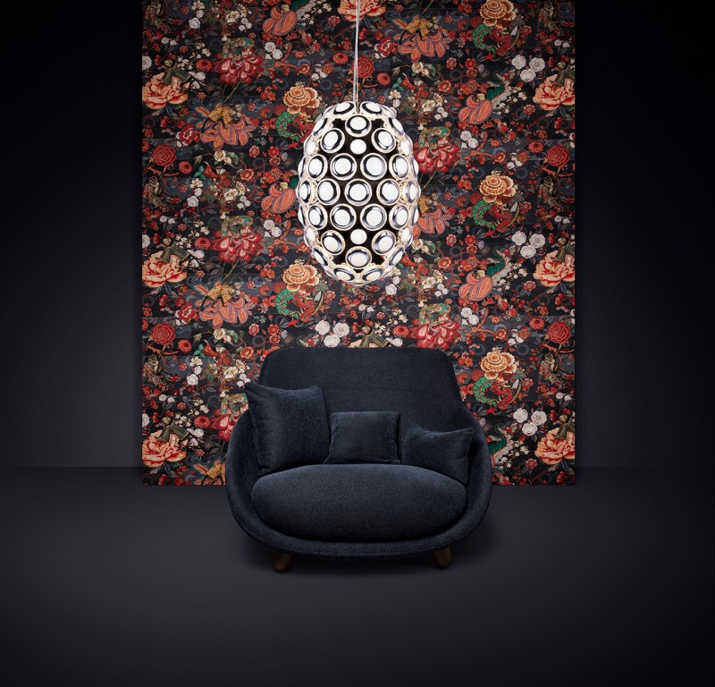
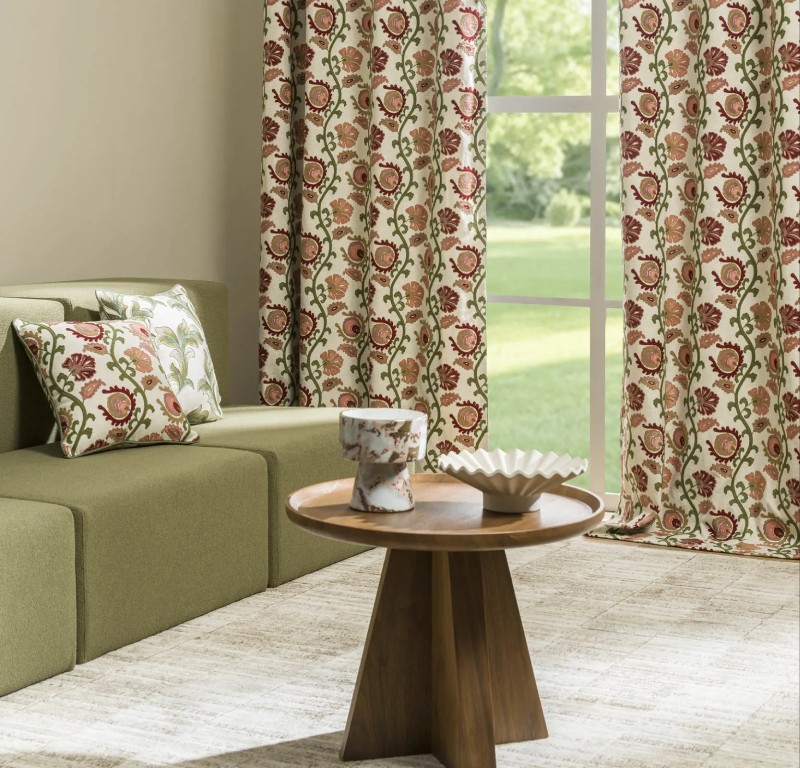
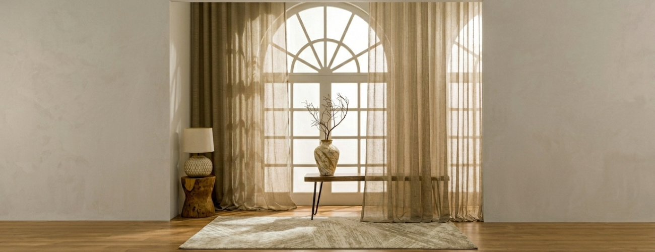
For design 2026, natural and muted colours that easily go with the modern design of furniture are most sought after. Earthy neutrals like beige, taupe, clay, and sand give a warm and inviting feel, and their popularity is increasing. Among modern designs, the use of cooler shades is increasing, especially in slate blue, charcoal grey, and sage green.
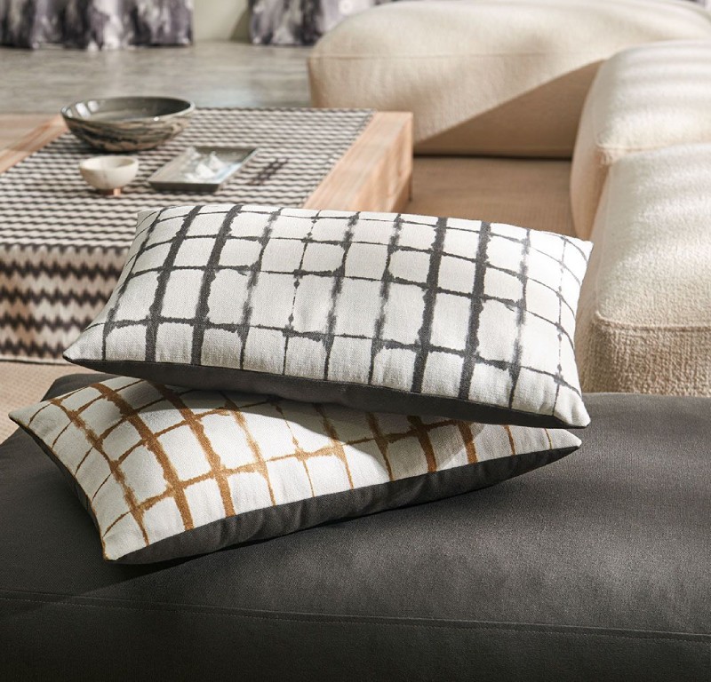
Aesthetic appeal can be increased with the use of certain materials like linen, dobby weave, and light jacquards that add an increased sense of dimension and tactility. These textiles create rich light and colour interactions that provide soft transitions and layered effects. Knowing how to choose a curtain combination for the living room that is both dynamic and harmonious is a great skill.
To choose curtains for your living room, consider the existing colour scheme. Walls, sofas, rugs, and decorative items combine to create a base colour story. Success with a wall and curtains colour combination means coordinating not copying.
To create a pleasing combination, consider the dominant and secondary colours in the room.
Bold curtain colours, like burnt orange and deep teal, stand out and create a visual focus in a room with neutral walls and wood furniture. Alternatively, if your furniture is patterned, curtains in soothing colours, like cream, light grey and soft pastels, create a calmer feel. It is also important to consider the colour and temperature of the room. For example, in a neutral room, warm accent pieces are great, and in a warm room, soft, cool curtains are a better choice.
Knowing how to choose curtain colour allows you to create a purposeful, balanced, and more seamless interior. Here are some steps to help.
For living rooms, calming curtains are advisable like dusty blue, and olive green. For more energetic rooms to host guests, closed ones terracotta and bold jewel tones are better.
Curtains that are close to the wall paint colours evens the space out. Bold colour changes can create more depth, and visual interest. A popular guideline is the 60, 30, 10 rule:
The curtains can be on the darker spectrum of paint if the room gets a lot of natural light. If the room is a little darker, the curtains should be light and reflect light.
For a more accurate colour reflection, use thin fabric and show it in different light levels.
The latest trends in living room curtain colour choices offer a mix of modern and timeless options.
The colour of the curtain choices helps determine accent colour changes, helping to simplify the replacement of home décor.
Choosing trendy curtain ideas built for the individual helps personal décor.
The sheer and opaque curtains are layered to control light and privacy. The sheers soften the light passing through, and the heavier curtains offer insulation and create a sense of drama in the space.
Select panels that are light at the top and darker at the bottom; this gradient effect adds depth and draws the eye down, increasing the sense of height of the ceiling.
For a clean and sophisticated look, go for a single colour family, such as light grey and charcoal, or even lighter and darker shades of a colour.
Curtains with a slight stripe or border pattern will aid in the division of space and provide a sense of order and rhythm without overwhelming the space.
These methods will help improve your curtain combination for living room spaces and keep in line with your already existing decor.
The curtains should not clash with the window coverings. With regard to the choice of upholstery for the sofa, coffee table, and rug:
Your thoughtful coordination of curtain colour combination makes it possible for your design to express itself seamlessly in the room.
A good wall and curtain colour combination means your windows will enhance your overall room design:
These are the strategies to achieve a refined look with curtain combination for living room designs.
In your room, the different lighting conditions impact the colour in different ways as:
It is important to know the lighting of the room to make sure your window curtains colour combinations are aligned with the daily changes in light.
Your choice in elegant curtains for living room interiors can be elevated further by selecting elegant fabrics and finishes:
Your choice of finish further indicates the intended use of the curtains; light fabrics indicate they will be worn often and are easy to clean, while heavier weaves indicate a need for insulation and privacy.
Curtain stores in Delhi have a lot of premium options, but Drapsey in particular has the best range of fabrics, custom tailoring, and personalised design support.
Drapsey has personalised matching services that will help you with future curtain colour combinations that will fit your decor and design needs best. Our designs span a range from classic colour tones to modern accent shades that cater for a variety of themes and styles of architecture.
The curtain colours for living room fabrics of your choice will be available in store, and will help you to experience and determine the right fabric, the way light works with it, the right colours, and how it will change your overall space.
With careful consideration, your ideas for curtain combinations will be streamlined and adaptable to changes in your décor.
Selecting good combinations of colours and curtains for living room spaces is a true skill, and gets even better when you learn how to pair fabrics to create that feeling of streamlined quality as well. It’s pivotal to your home’s atmosphere. Once you master the basics of colour, light and space, you will create the perfect living room curtains, maintaining that ideal balance of function and style, along with your thoughtful layering or calm neutrals.
Thoughtful selection of the curtain colour, along with integration with furnishings, and creative combinations of window curtain colours, brings a sense of sophistication and warmth to your living room. Drapsey is one of the best curtain stores in Delhi for premium, stylish, and functional window treatments that blend with your lifestyle and design Drapsey is one of the best curtain stores in Delhi for premium, stylish, and functional window treatments that blend with your lifestyle and design.
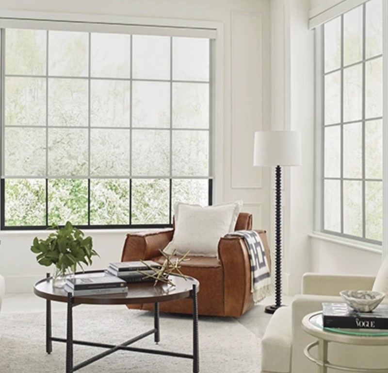
For compact spaces, opt for light and neutral curtain colours for living room areas such as beige, cream, or pastel shades. These tones reflect natural light and create an airy feel. Pairing them with a subtle wall and curtain colour combination can make the room appear more spacious and balanced.
White walls offer flexibility, allowing bold or soft curtain colour combination choices. Deep blues, emerald greens, or warm earthy tones add contrast, while greys and taupes maintain a minimalist look. Choose a curtain combination that complements furniture and décor accents for cohesive styling.
Yes, dark shades like charcoal, navy, or burgundy can create dramatic and classy curtains for living room settings. Balance them with lighter walls and décor to avoid heaviness. Proper lighting and texture selection are key to achieving an elegant finish.
Curtains don’t need to match exactly, but they should harmonise with either the wall or upholstery. A well-planned curtain combination for the living room often complements both elements, creating a cohesive design without appearing overly coordinated.
Current trends in window curtains colour combinations include earthy tones like terracotta and olive, soft pastels, and dual-tone layering. Textured fabrics and subtle patterns are also popular, adding depth while maintaining a refined aesthetic.
Dive into the buzz!

ADDRESS
M/S Drapesy
Unit No. 1&2, FF,
Plot No. 9, Aya Nagar,
Opp. Metro Pillar No. 190,
Arjangarh Metro Station
New Delhi 110047
HAVE ANY QUERIES?
OUR EXPERIENCE CENTRE
REQUEST CATALOGUE
OUR SOCIAL NETWORKS